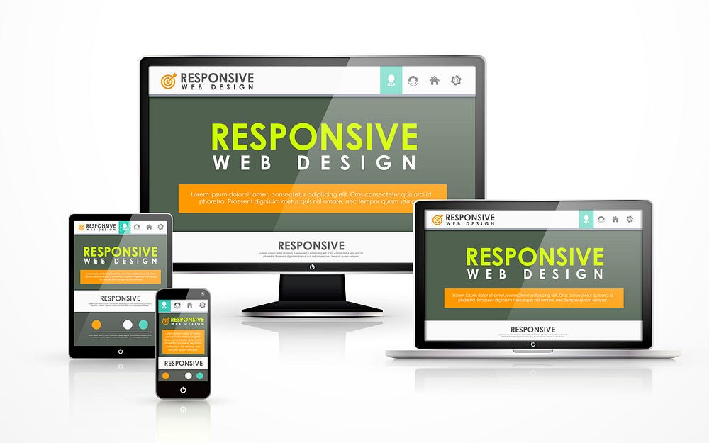
Responsive web design (RWD) has become an essential skill for web developers today. Since more people use their phones than their computers, having a website that works well on all of them is no longer a choice, it’s a must. Because of this, any web developer needs to know how to use responsive techniques.
As a result, responsive web development is a hot topic in job interviews. Employers want to gauge candidates’ expertise in this field to ensure they can create sites providing optimal viewing and interaction experience across devices.
To help aspiring web developers ace their upcoming interviews, here are the top 10 responsive website development interview questions frequently asked by employers
1. What is your background and experience in responsive web development?
This is often one of the very first questions interviewers ask They want to understand your overall expertise with responsive principles and techniques,
When answering, provide an overview of any responsive site projects you’ve worked on. Mention specific skills like
- Creating fluid grid layouts using Flexbox or CSS Grid
- Implementing media queries for layout adjustments
- Developing mobile-first designs
- Optimizing images and videos for fast loading
- Making sites accessible across browsers and devices
Quantify your experience in years/months if possible. Share any formal responsive web design training you have. Having hands-on experience and solid technical knowledge is key.
2. How do you test and ensure a website is responsive across devices?
Testing responsiveness across real devices is crucial. Interviewers want to know your testing and QA process.
Explain how you:
- Physically test on smartphones, tablets, laptops, and desktops.
- Use browser developer tools to simulate various devices.
- Leverage services like BrowserStack and Lambdatest for live testing.
- Validate HTML/CSS compliance with W3C validators.
- Audit site speed with PageSpeed Insights and WebPageTest.
- Check accessibility using WAVE tool and screen readers.
Share any issues you faced and how you resolved them. Demonstrate a thorough testing approach covering key areas.
3. What are some best practices you follow when designing responsive websites?
Share the techniques and principles you adhere to when crafting responsive designs:
- Mobile-first approach focusing on core content first
- Layouts based on Flexbox, Grid, floats for flexibility
- Font sizes in relative units like REM for fluid typography
- Media queries to progressively enhance layouts
- Responsive images using srcset and sizes
- Critical CSS delivered before other stylesheets
- Eliminating unnecessary bloat for performance
Explain how these practices enhance responsiveness and deliver the best user experience.
4. How do you handle navigation menus in a responsive design?
Navigation menus can be tricky on smaller screens. Interviewers want to understand your solutions for these.
Explain how you:
- Use flexbox or CSS grid to rearrange menu layouts across breakpoints.
- Implement hamburger menus and off-canvas sidebars for mobile.
- Ensure menus are accessible through proper HTML structure, ARIA roles, and keyboard/screen reader support.
- Optimize menu performance with techniques like Ajax loading of submenus.
- Leverage libraries like Bootstrap for pre-built responsive components.
Share any innovative approaches you’ve implemented for navigation.
5. What are some key differences between responsive and adaptive design approaches?
Understanding the differences between responsive and adaptive methodology is imperative.
Explain how:
- Responsive design uses fluid layouts that continuously adapt across the full spectrum of screen sizes.
- Adaptive design uses set breakpoints with fixed layouts tailored to each screen size range.
- Responsive design scales smoothly while adaptive can sometimes feel disjointed.
- Adaptive requires designing multiple page layouts while responsive typically only needs one flexible layout.
Share your views on when you’d choose one approach over the other. Show domain knowledge.
6. How do you optimize images and videos in responsive design?
Optimization of visual assets is vital for website performance. Interviewers want to assess your expertise here.
Discuss how you:
- Use srcset and sizes for serving responsive images.
- Leverage next-gen formats like WebP and AVIF.
- Optimize images with tools like TinyPNG.
- Lazy load images below the fold.
- Compress and resize videos for mobile.
- Use CSS sprites for icons and UI elements.
- Set width and height attributes for proper sizing.
Share any challenges faced and how you overcame them.
7. How do you handle typography and readability across screen sizes?
Responsive typography is crucial for readability across devices. Share how you:
- Avoid absolute font sizes, preferring relative units like REM instead.
- Leverage viewport units like VW for scalable text.
- Use fluid type libraries like Sass MQ.
- Adjust line height, spacing, and contrast across breakpoints.
- Choose font families optimized for screen vs print.
- Ensure text can scale up on mobile without overlapping.
- Limit line length for comfortable reading.
Being able to explain your responsive typography approach demonstrates good UX understanding.
8. How do you optimize Website performance in responsive design?
Site speed is especially vital for mobile users. Explain your optimization strategies:
- Lazy loading of non-critical resources.
- Loading CSS asynchronously.
- Minimizing HTTP requests through asset combination.
- Image optimization as discussed previously.
- Eliminating render-blocking JavaScript.
- Optimizing code – minification, compression, caching.
- Using CDNs and other caching mechanisms.
Share how you measure performance and continuously improve it.
9. What are some challenges you faced in implementing responsive design?
Recounting specific struggles shows authentic experience. Share difficulties like:
- Dealing with complex, multi-column layouts.
- RWD implementation in legacy websites built with outdated code.
- Limited browser support for newer CSS features.
- Balancing aesthetic design needs with performance constraints.
- Increased development and testing effort.
- Handling certain UI elements like calendars or data tables.
Importantly, follow up each difficulty with how you successfully overcame it. This highlights your problem-solving ability.
10. Why is responsive design important for business websites today?
Finally, interviewers want to assess your broader understanding of why responsive design matters.
Explain how:
- Mobile usage has overtaken desktop browsing.
- Google favors mobile-friendly, responsive sites in search rankings.
- Responsive sites reduce bounce rates and boost conversions.
- Visitors expect a seamless experience on any device.
- It improves branding consistency across platforms.
- Developing one responsive site is more efficient than separate mobile and desktop sites.
Emphasize how crucial responsive design is for delivering the optimal user experience today.
Key Takeaways
Preparing answers to these common responsive web development interview questions will help you impress potential employers. Showcase your technical expertise along with testing skills and performance optimization know-how.
Demonstrate your understanding of core responsive principles and ability to implement them effectively. Recall examples of challenges you faced and overcame. This will establish you as a competent responsive web developer ready to create successful responsive experiences.
With mobile usage only increasing, having strong responsive skills is one of the top requirements for web developers today. Prepping well for the questions above will help you prove you’ve got what it takes to thrive in this field!
Toptal sourced essential questions that the best web designers can answer. Driven from our community, we encourage experts to submit questions and offer feedback.
What is “white space” and how does it affect web content? What are some ways that “gestalt” works?
White space in graphic design is any area left intentionally blank. It doesn’t have to be white. On the web and in other media, white space can be used to visually separate or group elements, draw attention to a certain element, or support the content layout or grid. Sometimes, white space is also used purely aesthetically to create visually interesting compositions.
Gestalt principles are part of the theory of visual perception. They talk about how the mind can “see” things that aren’t there by subconsciously putting shapes together, finding similarities, and putting together pieces that are physically separate. A few of the principles commonly used in design are:
- Similarity: Things that look alike (in color, shape, size, or a mix of the three) are seen as connected, meaningfully linked, or grouped together by the mind. This is especially helpful for designing navigation systems and toolbars for apps;
- Proximity: Like the similarity principle, things that are close to each other are thought to be related, grouped, or part of a whole. This is a building principle of layout design. It’s especially important when making pages with a lot of different kinds of content, like the home page of a news website or app.
- When you look at something familiar that you can’t quite picture because some parts are missing, your mind automatically “completes the picture” or fills in the blanks so you see it as if it were fully displayed. This is a principle often used in logo design. If you use the closure principle, an element will be more interesting to look at because the user will have to “work” to finish it, which makes the design stand out.
- Figure-ground relation is the way our minds separate “objects” from “backgrounds” based on color, shape, and what we know from the past. This principle draws attention to important parts of a composition when used correctly in graphic design;
- Common fate: things that move at the same time are often thought of as a group or as parts of the same object. Common fate can be useful in interaction design; .
- It’s possible for the mind to see links and choose one path over another based on similarities, as well as to follow lines past their ends. This idea can be used to get people interested in logo design. When making layouts or compositions, it can also be used to make them look like a single clean object instead of a bunch of jumbled parts.
2 .
When putting fonts together, how do you do it? Which fonts look good together? How many may you use on a website?
Some fonts work together nicely and look good on the same page. See what two fonts have in common and what makes them different (serifs, historic background, x-height, thickness, aperture, stroke contrast) before putting them together.
As a general rule, two fonts work well together if they are either very different from each other but share one important trait (complementary fonts) or very similar except for that trait. It’s always good for two fonts to share the same x-height, which is the difference between the height of a lowercase “x” and an uppercase “X” of the same font size.
It is not a good idea to mix fonts that look too much alike, like Helvetica with Lucida Grande or Arial with Verdana.
A few rules to create good combinations:
- There isn’t much difference between a serif and a sans-serif font in terms of x-height, stroke contrast (the difference between the thinnest and thickest parts of a character’s lines), or aperture (how open or closed the characters are).
- Use different thickness options for the same font. For example, a font’s light/thin version is very different from its bold/black version, and the two work well together.
- There are groups of fonts that are made to work well together. One pair from Adobe is Myriad and Minion. Another pair is Museo with Museo Sans and Adelle with Adelle Sans.
- When you choose fonts, you should think about what they will be used for. The font used for headings or the display could be fancier, more detailed, and more expensive. The font used for the main text, on the other hand, should be simpler and easier to read at smaller sizes.
- One or two font families should be enough for most designs, with a third being used only sometimes for very specific tasks.
3 .
What makes a good color scheme? Give some examples of color schemes that are parallel, contrasting, or all one color.
There’s a reason why some color combinations look better than others: our minds are wired to look for harmonies, order, and systems, and color schemes that follow these look more “pleasant.” There are several ways to combine colors effectively.
Here are a few:
- One-color means using a few different shades of the same color. For example, you could mix light green with deep, dark green and use bright green for accents. It’s good for foreground color and background color combinations.
- When you use analogous colors, like orange and yellow, blue and green, or red and purple, they are close to each other on the color wheel and in the rainbow. It works best for elements that are next to each other, but not as well for combinations of foreground and background.
- When you use complementary colors, like orange and purple, blue and yellow, or green and red, they pull each other out. Most of the time, these colors contrast well, and if they are also different shades of light, they can be used together as foreground and background colors. The designer should keep in mind that some color combinations that go well together don’t look good (for example, red on green and green on red are annoying to look at and are rarely used together), while others have beautiful contrast.
Apply to Join Toptals Design Network
and enjoy reliable, steady, remote Freelance Web Designer Jobs
When do you use JPEG compression and when would you prefer PNG instead?
Different compression formats have different purposes with different compression methods.
- JPEG compression shrinks files by looking for areas of similar color. The higher the compression level, the harder it looks for these areas, which results in losing visual information and making artifacts around the edges of the compressed areas. This compression works well for photos, drawings, gradients, most illustrations, and other rich, colorful files Screenshots, flat icons, schematics, and simple UI elements don’t work as well in JPEG. Text doesn’t work at all.
- PNG compression works by reducing the number of used colors. If the compression is too high, this could cause some color shades to be lost. PNG is great for logos, icons, signs, and simple illustrations, as well as for screenshots and UI elements. Unlike JPEG, it also allows s to have transparent areas. Most of the time, PNG files are bigger than JPEG files, and they don’t compress photos or images with lots of colors and gradients very well.
5 .
How do you work with s for Retina, 4K, UHD, and other high-resolution screens? How do you make and understand raster mockups for high-resolution screens, like most smartphones? What’s the most important thing to keep in mind?
Many devices have screens with a lot of pixels, so it’s important for some things on a website to have a high resolution. This is especially true for things like logos, figures, schematics, and product photos that have simple shapes and fine lines.
- Until most browsers start using the new PICTURE tag, techniques like PictureFill can be used when an is used as an IMG tag in HTML. These steps let you show various types and sizes of s to users based on their screen size and pixel density.
- Media queries can be used as a background in CSS to target different devices and show each user the best size of an image.
- When you make or cut Photoshop (or other) mockups for smartphones or other high-pixel-density devices, keep in mind that the mockup is twice as big as it would be on the device. The 1280-pixel screen width of a device is usually thought of as 600-pixel wide. This means that text that is 32 pixels high in the mockup should be coded as 16 pixels high in the CSS file, and text that is 300 pixels wide will be 150 pixels wide on the web page for that device. It is best to think of each two-by-two-pixel square in the Photoshop mockup as a single pixel on the real device.
6 .
When you embed self-hosted video on a web site, what format would you use?
When you use the HTML5 video element to add video to a website instead of embedding from YouTube, Vimeo, or another video-hosting service, it is the website’s job to make sure that every browser can play that video.
As of recently, major browsers, OS and devices support the MP4 video format (using MPEG4 or h. 264 compression). To make sure the video works on Firefox clients and some Android devices that can’t play MP4 files, it’s helpful to have OGV and WebM copies of it. When multiple copies are available, all files should be listed as source elements of the VIDEO tag. 7 .
Name a few easy ways to optimize a website. Where would you start?
There are many ways to make a website run faster, and developers may have ideas that are unique to each project. A few of the more common and easy to implement optimizations are:
- Cut down on CSS and JS code to make each page load faster by a few hundred kilobytes.
- Make sure that all of your assets are compressed in the best format and with the best settings (it’s important to find a good balance between quality loss and speed gain).
- Turn on server-side caching tools like Memcached, Redis, gzip compression, APC, and more. ).
- Serve responsive s based on the size and density of the user’s device screen and only load the ones that work for them.
- Don’t include compiled frameworks and don’t load scripts or CSS modules that aren’t being used. Write HTML that is clear and to the point.
8 .
How many H1 tags can you have on a single web page? Does it even matter?
A page should only have one H1 element, unless it has an ARTICLE or SECTION element. In that case, each of those can have its own H1.
Search engines and other computers that read web pages and figure out what they mean need the H1 tag. The H1 of a document, article or section is considered to be its main heading or title. Not using H1 elements properly can impact the website’s SEO performance. 9 .
When do you use the following HTML5 tags: STRONG, EM, SMALL?
These tags change the way text looks (STRONG makes it bold, EM makes it italic, and SMALL makes it smaller), but that’s not what they’re for, and you shouldn’t just use them to style content in a certain way.
Each of the three has semantic purpose and should only be used to mark text as follows:
- EM – Emphasized text. This text needs to be emphasized, which will change what it means in its context.
- STRONG – Strong importance. Use it in titles, headings, or paragraphs to draw attention to the most important word or phrase in a sentence. It can also be used to make a word or phrase sound more important or serious.
- SMALL – Small print. This is used to warn, explain, or generally lessen the emphasis on the marked text.
You don’t have to abuse semantic HTML5 elements to make text bold, italic, or smaller. Instead, you can use generic tags and apply the styles with CSS code. 10 .
Why would you bother marking up elements as ARTICLE, FIGURE, ASIDE?
HTML5 provides many new element types so the more complex content may be properly marked up. This helps machines (such as search engines, parsers, screen readers, etc. ) read a web page and understand its content structure.
- ARTICLE refers to a piece of content that stands alone and has its own heading. It can exist outside of its web page. Useful for a news piece, an article, a product.
- FIGURE refers to a picture that goes with the text, like a diagram, blueprint, or chart. With FIGCAPTION, you can also add a picture that describes the
- Information that is related to the page’s main content but not part of it is shown as “ASIDE.” A list of articles that are related to the main article and talk about the same subject would be an example of this.
11 .
When you use a CSS framework like Bootstrap or Foundation, what are the pros and cons? How should you incorporate frameworks into your work?
- Benefits: Frameworks make it easy to quickly test layouts, elements, and pages, and they encourage using the same elements throughout the whole project. This often gets rid of the need for deliverables that don’t help, like Photoshop mockups or other high-fidelity static sketches. The HTML prototypes, on the other hand, that are powered by a framework later turn into the production templates code that the new site uses. A big plus is that the better frameworks come with a lot of development tools, such as LESS/SASS preprocessors, variables for important values in the design, builder tools like Grunt/Gulp, and ready-to-use JS scripts for common interactions like modals, carousels, and collapsing boxes. Lastly, frameworks come with a lot of people who can help you with problems. They include best practices and standard, well-documented code that is used a lot.
- Cons: Frameworks have a lot of built-in features and save you from having to write the same code over and over again. However, they tend to generalize common elements, which can make designs look the same. Another thing to keep in mind is that “fighting” frameworks takes more work than just writing the code from scratch when you use them for a complicated or unusual design or a layout with a more complicated grid. Frameworks often have extra features that aren’t needed or styles that are duplicated and overridden if they’re not used correctly. This makes the code load more slowly than code that was written from scratch.
To use a CSS framework correctly, developers shouldn’t include the framework’s compiled CSS and then write their own overrides. To get the most out of the framework, you should use the built-in development tools. Variables should be set, LESS/SASS mix-ins should be used, and components that aren’t being used should be removed. Another common mistake is relying too much on framework markup for layout and styling. This makes it harder to separate content and style and means that changing the design needs to be done in HTML instead of CSS. 12 .
How is the Mobile First approach different from the Desktop First approach when it comes to responsive web design? Where does each approach shine, and what problems does it cause?
Mobile First is a way to make responsive CSS code. The styles for mobile devices are written first, without media queries. For each screen size step up, a new media query is added that changes, adds to, or removes the styles from the previous (smaller) step.
- Pluses: It’s easiest to speed up load times on smaller screens because no extra styles or assets are needed (the assets linked in the following media queries don’t get loaded). Very useful for simple designs where bigger screen styles are better versions of the smaller ones. For example, when extra elements or decorations are added to make the experience better on bigger screens
- Cons: This method doesn’t work as well if the layouts on mobile and desktop are very different, if the layouts are complicated, or if the web app isn’t simple. In this case, the Mobile First code gets too complicated because it has too many overrides.
The traditional way to write CSS is “Desktop First.” The desktop version of the styles either doesn’t have any media queries or starts with a minimum width requirement. For each screen size smaller than the initial one, a new media query is added, going from biggest to smallest. With each consequent media query, elements are hidden, rearranged or re-styled.
- Pros: Unlike the Mobile First method, Desktop First works best for designs that change a lot between screen sizes, like when parts are taken away as the screen gets smaller. This is also the only way to make an older website responsive without having to rewrite its code.
- Cons: If it’s not done right, it could cause code and assets that aren’t needed or are already there to be loaded on smaller devices, making the website heavier on smartphones. This means that styles are overridden when they aren’t needed, and extra code is written for simple designs where Mobile First could be used more easily.
When websites have slightly different mobile and desktop versions, it’s usually best to serve two separate stylesheets based on screen size or separate the two layouts in media queries that don’t overlap, making each one very specific to the device it’s meant for.
There is more to interviewing than tricky technical questions, so these are intended merely as a guide. Not every good candidate for the job will be able to answer all of them, and answering all of them doesn’t mean they are a good candidate. At the end of the day, hiring remains an art, a science — and a lot of work.
Tired of interviewing candidates? Not sure what to ask to get you a top hire?
Let Toptal find the best people for you.
Our Exclusive Network of Web Designers
Looking to land a job as a Web Designer?
Let Toptal find the right job for you.
Job Opportunities From Our Network
Submit an interview question
Questions and answers sent in will be looked over and edited by Toptal, LLC, and may or may not be posted, at their sole discretion.
WEB DEVELOPER Interview Questions And Answers! (How to PASS a Web Development Job Interview!)
FAQ
What is responsive in web development?
What are the three pillars of responsive web design?
What are the three main elements of responsive design?
What are the core principles of responsive web design?
How do I prepare for a job interview with responsive web design?
Prepare for the types of questions you are likely to be asked when interviewing for a position where Responsive Web Design will be used. As more and more people access the internet from mobile devices, it is important for web developers to create websites that are responsive and adapt to different screen sizes.
What are the interview questions for web development?
Below is a list of interview questions for web development for those applying for front-end developer positions. These questions cover a range of topics, from basic HTML, CSS, and JavaScript concepts to more nuanced questions about responsive design and performance optimization. 1. What is HTML? Explain the basic structure of an HTML document.
What is a responsive web design?
Answer: To answer this question, let’s check out two definitions. Responsive web design uses fluid grids and flexible layouts to change websites for different screen sizes. With responsive design, the layout of the webpage adjusts dynamically based on the device’s screen size. This means that the same HTML and CSS code are delivered to all devices.
What is a senior web developer interview question?
This is one of the senior web developer interview questions where you’re expected to showcase your in-depth knowledge, problem-solving abilities, and deep understanding of complex web development concepts.